Back to menu
Controls
There are a couple of available controls in a
theme.
You must always
- precise the x and y coordinates
- complete "src" with
the localisation of the source .bmp file.
Other arguments are optional, e.g. width and
align on text fields and the actions and triggers
on buttons.
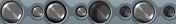
button
|
Button control. (new
format since version 2.2)
src contains three button states: normal,
highlighted, pressed.
The action defines what action to take
when the button is pressed.
"visible" attribute can be
added, so buttons can stay hidden until
you decide to make them visible.
A button control that is hidden does not
respond to mouse input, so the
corresponding action is impossible.
If you specify activenotify="1",
the bitmap should contain two bitmaps,
the first is shown when the window is
inactive and the second when the window
is active.
The 'trigger' attribute no longer means
enable/disable the button. Instead it
means 'force press' .
So if you specify a trigger and the
trigger is true, the button will be
pressed otherwise the button will behave
normally.
Example :

<button x="156" y="37"
src="buttons/STOP-BUTTON.bmp"
action="emu-stop" visible="not
emu-stopped"/> |
dualbutton
|
Dual button control. (new
format since version 2.2)
The button has two parts, the left is
usually a dropdown menu and the right the
most common menu item.
src contains four button states: normal,
highlighted, left pressed, right pressed.
"visible" attribute can be
added, so buttons can stay hidden until
you decide to make them visible.
A button control that is hidden does not
respond to mouse input, so the
corresponding action is impossible.
If you specify activenotify="1",
the bitmap should contain two bitmaps,
the first is shown when the window is
inactive and the second when the window
is active.
The location of the dropdown menu can be
specified with "direction"
attribute.
If the buttons are designed vertically,
the dropdown menu will be located in the
corresponding direction.
"arg1x/arg1y"&"arg2x/arg1y"
attributes are for setting the location
of the dropdown menu in x/y coordinates.
"arg" are for actions that
concerns the menu. 1&2 stands for
action1 & action2.
Example :
<dualbutton x="49" y="32"
src="buttons/RESET-BUTTON.bmp"
action1="emu-resethard" action2="menu-reset"
arg2x="80" arg2y="50"/> |
grabimage
|
Bitmap image on which you can push
the mouse button and drag the window.
If you specify activenotify="1",
the bitmap should contain two bitmaps,
the first is shown when the window is
inactive and the second when the window
is active.
Example :

<dragimage x="0" y="0"
activenotify="1" src="MixerTop.bmp"/> |
key code
|
Keyboard key code. (introduced
in version 2.2 )
you must precise the code of the
concerned MSX keyboard key
Example :
<key code="underscore" x="228"
y="84" width="17"
height="17"/>
List of the different codes :
f1 - f2 - f3 - f4 - f5 - stop -cls -
select - ins - del - esc
1 - 2 - 3 - 4 - 5 - 6 - 7 - 8 - 9 - 0 -
neg - circomflex - backslash - backspace
- tab
q - w - e - r - t - y - u - i - o - p -
at - leftbracket - return - ctrl
a - s - d - f - g - h - j - k - l -
semicolon - colon - rightbracket -
leftshift
z - x - c - v - b - n - m - comma -
period - div - underscore - rightshift
caps - graph - torikeshi - space - jikkou
- code - pause
left - up - down - right
num7 - num8 - num9 - numdiv
num4 - num5 - num6 - nummul
num1 - num2 - num3 - numsub
num0 - numperiod - numcomma - numadd
print |
image
|
Stateless bitmap image
Example :
<image x="30" y="20"
src="bitmap.bmp"/> |
led
|
Two state bitmap image on/off
controlled by a trigger
Example :

<led x="30" y="552"
src="DIGIBLUE.bmp" trigger="not
emu-stopped"/> |
meter
|
Meter control.
The number of bars in the bitmap is set
by "max" which can beat most 99.
src needs to contain "max"
number of bitmaps.
Example :

<meter x="454" y="617"
max="13" src="MIXER/METER-L.bmp"
trigger="volume-master-left"/> |
slider
|
Slider control.
The number of pans in the bitmap is set
by "max" which can beat most 99.
src needs to contain "max"
number of bitmaps and how many columns
are concerned for each pan.
The direction of the slider can be
specified with "direction"
attribute.
You can also specify his sensitivity
Example :
<slider x="71" y="58"
src="SWITCHES/SLIDER-RENSHA.bmp"
max="11" srcColumns="1"
trigger="slider-rensha" action="slider-rensha"
direction="horizontal"
sensitivity="3"/> |
text
|
Text field.
The data is controlled by a trigger (only
text- triggers)
src defines the font to use (only fixed
size fonts supported at the moment)
"visible" attribute can be
added, so texts can appear only when
emulator is running or stops.
"align" attribute is for
setting the alignment of the text and
currently supporting right & left.
Example :

<text x="67" y="7"
width="6" align="right"
visible="emu-stopped" src="ICONS/FONT-SMALL.bmp"
trigger="text-cpuusage"/>
<text x="67" y="7"
width="6" align="right"
visible="not emu-stopped" src="ICONS/FONT-SMALL.bmp"
trigger="text-vramsize"/> |
togglebutton
|
Toggle button control. (introduced
in version 2.2 )
src contains two groups of three button
states: normal, focused and pressed
when the button is in off state (3 first
states) or in on state (3 last states).
The action defines what action to take
when the button is pressed.
"visible" attribute can be
added, so buttons can stay hidden until
you decide to make them visible.
A button control that is hidden does not
respond to mouse input, so the
corresponding action is impossible.
If you specify activenotify="1",
the bitmap should contain two bitmaps,
the first is shown when the window is
inactive and the second when the window
is active.
The 'trigger' attribute no longer means
enable/disable the button. Instead it
means 'force press' .
So if you specify a trigger and the
trigger is true, the button will be
pressed otherwise the button will behave
normally.
Example :

<togglebutton x="63" y="11"
src="video-block/vidout-button2.bmp"
trigger="status-hstretch"
action="switch-videohstretch"/>
|
Back to menu
|
|